Responsive Web Design in Action: A client's case study
It is easy to talk a big game about the value of a great responsive web design and search engine optimization strategy.
But the truth is in the results, and here at CyberStrides, we aim to be transparent about the work we do, the goals we set, and the targets we hit. So, to show you how we can directly help your business, let's take a look at all of the progress we helped one of our clients make.
Responsive Web Design Case Study Details:
C&C Fluid Power is a hydraulics solutions company working in the industrial, oil and gas, and electric service industries. They offer services like hydraulic repair, hydraulic design and builds, and hydraulic engineering.
They have done work in numerous locations, but we helped them create a web design responsive enough that it seamlessly moves from desktops to tablets to mobile phones.
C&C Fluid Power started with one single website page with minimal information. All they had on it was their name, logo, and phone number. But we knew that the more information they gave, the more customers would be able to learn about their company.
Also, more details about the services they provided would help them rank with SEO.
We worked with the owner and staff on a full-service web design. Now, their website includes a seamless home page, about page, products and services pages, and their portfolio.
Their brand identity is consistent throughout their site. Customers can easily find all of the information they need to click one of the strategically placed calls to action and contact them for more.
In addition to the complete website redesign, we also raised the bar on their search engine optimization strategy—or more like sent that bar crashing through the roof.
Responsive Web Design Case Study Results:
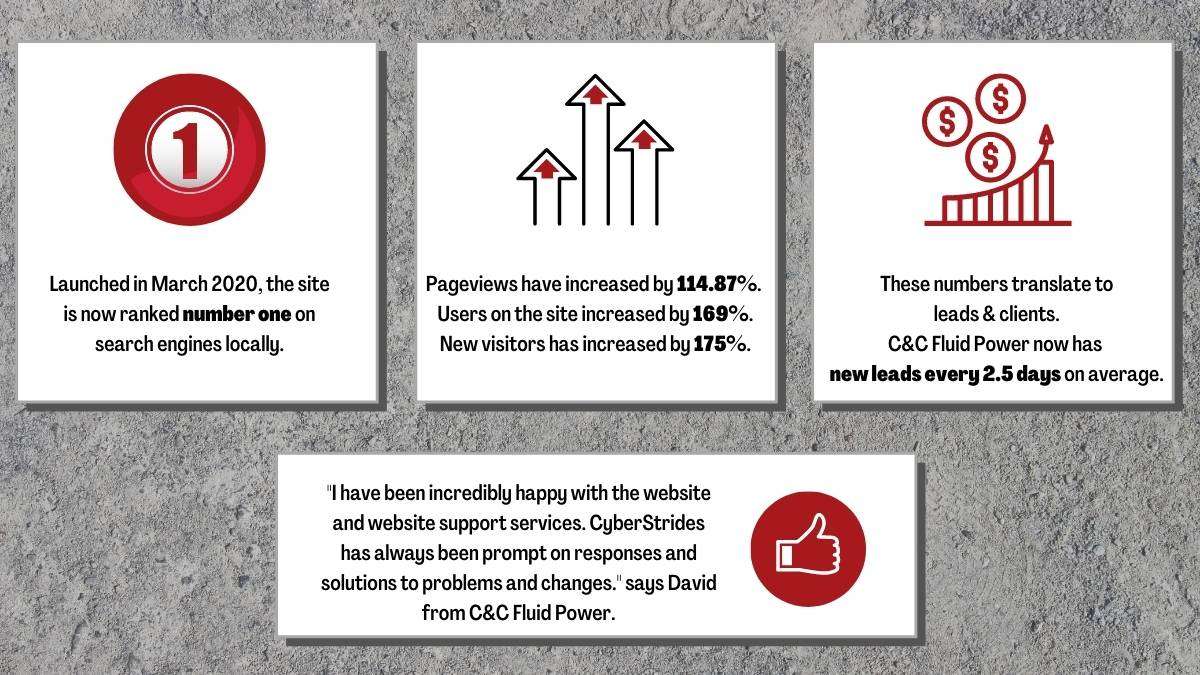
The new website was launched in March 2020, and as of now it is ranked number one on search engines locally.
Pageviews have increased by 114.87 percent. The number of users on the site has increased by 169 percent, new and unique visitors on the site also increased by 175 percent.
But these numbers translate to more than rankings and tick marks for visitors—leads and clients. Since the site has launched, C&C Fluid Power has had new leads every 2.5 days.
"I have been incredibly happy with the website and website support services. CyberStrides has always been prompt on responses and solutions to problems and changes." says David from C&C Fluid Power.
5 Responsive Web Design Best Practices
- Mobile-First Approach: Designing for mobile devices first ensures that your website is optimized for smaller screens and limited bandwidth. Start with a mobile-friendly layout and progressively enhance it for larger screens. This approach prioritizes the essential content and functionality, resulting in a better user experience across all devices.
- Flexible Grid and Layout: Use a fluid grid system and flexible layout techniques to allow your website to adapt to different screen sizes. Avoid fixed-width elements and embrace relative units like percentages and ems. This approach ensures that your content adjusts seamlessly to different devices, maintaining readability and usability.
- Media Queries: Implement media queries to apply different CSS styles based on the characteristics of the user's device. Use breakpoints to target specific screen sizes and adapt your design accordingly. By customizing the layout, typography, and images for different devices, you can optimize the user experience across a wide range of screens.
- Scalable Images: Optimize your images for responsiveness by using scalable image formats (e.g., SVG) and responsive image techniques (e.g., srcset and sizes attributes). This allows the browser to load the most appropriate image based on the user's device, reducing bandwidth usage and improving loading times.
- User Testing and Performance Optimization: Regularly test your website on various devices and screen sizes to ensure a consistent experience. Pay attention to performance optimization, as slow-loading pages can negatively impact user experience. Compress and minify your CSS and JavaScript files, optimize image sizes, and leverage browser caching techniques to improve overall performance.
Responsive Web Design Frameworks
In today's digital landscape, a responsive design framework has become an indispensable asset for web developers and designers. A responsive design framework, such as Bootstrap or Foundation, provides a solid foundation for crafting websites and web applications that can adapt seamlessly to various screen sizes and devices. This adaptability not only ensures a consistent and visually appealing user experience across a multitude of platforms but also takes into account the ever-evolving technological advancements and user preferences.
By employing a responsive design framework, developers can efficiently streamline the development process, reduce the need for extensive testing, and maintain the website's compatibility with future updates. As illustrated in our recent case study, implementing a responsive design framework has led to significant improvements in user engagement, conversion rates, and overall website performance. Embracing such a framework is a crucial step towards building a successful and future-proof online presence.
By incorporating these best practices into your responsive web design process, you can create a user-friendly and visually appealing website that provides an optimal experience across devices.
Does this sound like something that you and your business need?
No matter your niche, CyberStrides can work with you to achieve the same results.
Mobile responsive web design is an important part of SEO, and along with other SEO strategies, content creation services, and more, we have everything you need to turn your business's website into a money-making opportunity for you. Learn more by contacting us.


